
ACTIVE INTEREST MEDIA
AIM inspires an ever-growing audience of enthusiasts to enjoy their hobbies and interests. Through leading events, websites, magazines, and TV shows, AIM reaches tens of millions of consumers around the world. The AIM audience is smart, engaged, and loyal and looks to the AIM family of brands for expert insights and services that will inspire and enable them to enjoy their passions.
AIM brands include iconic titles like Fine Homebuilding, Popular Woodworking, Sail, Writer’s Digest, Power & Motoryacht, Log & Timber Home Living, Fine Woodworking, Kovels Antique Trader, Garden Gate, and more. The company’s two groups, Marine and Home, are divided into five divisions — Collectibles, Home Arts, Home Building, Marine, and Writer’s Digest —also operate thriving B2B platforms, online universities, events and offer marketing services.
Websites
AIM’s consumers sail across oceans, write screenplays, and grow elaborate gardens. They look to our websites to help them achieve their goals.
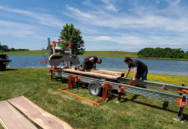
Magazines
Across five divisions and 36 brands, AIM publishes more than 25 well-known magazine titles plus a multitude of special interest publications, reports, and guides.
Events
AIM’s brands curate one-of-a-kind experiences that allow participants to take their passions to the next level, whether it’s sailing the seas or writing the next great novel.
Education
AIM’s interactive online courses combine world-class instruction with the convenience and immediacy of virtual education.
Marketing Services
Our team leverages a suite of services including research, content creation, digital marketing and creative services to ensure success for our clients.
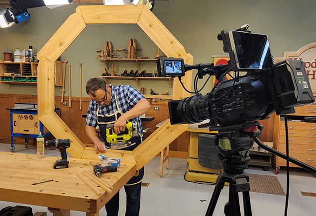
TV
Our television shows inspire, entertain and teach our engaged audience of hobbyists.
Video
We produce videos that tell stories. From promotional and marketing to educational, we translate our clients’ vision into compelling video.
Podcasts
AIM’s brands write and produce captivating podcasts designed to entertain and inspire our audience of enthusiasts.
AIM Video Goes Here

SEE WHAT'S NEW ON SOCIAL


CAREERS
We’re looking for people with passion! AIM is an enthusiast media company, dedicated to inspiring an ever-growing audience to pursue their hobbies and interests. There are many opportunities to work across one of our iconic brands. Fuel your own passion and find a career that aligns with your interests in gardening, woodworking, boating, collecting, restoration and more. Learn more about current job openings.